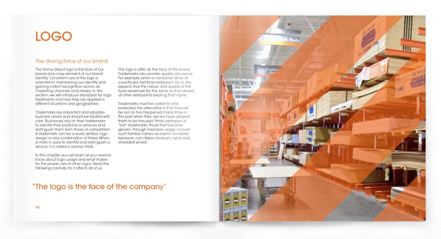
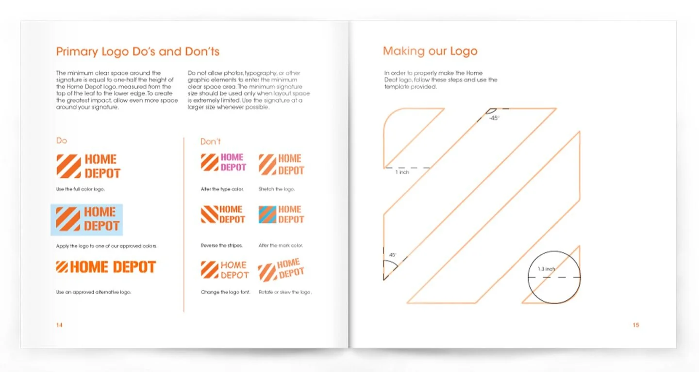
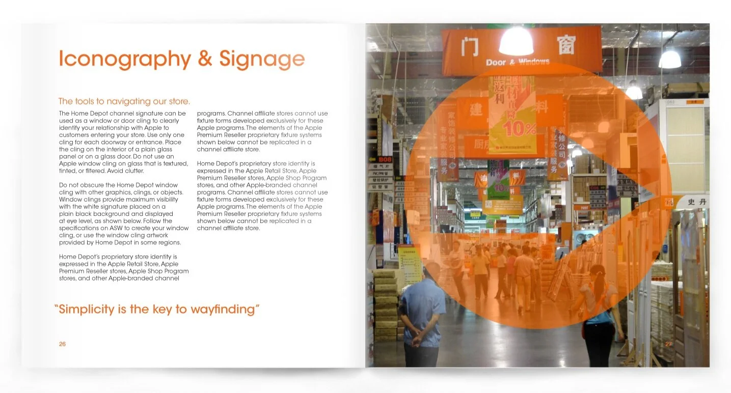
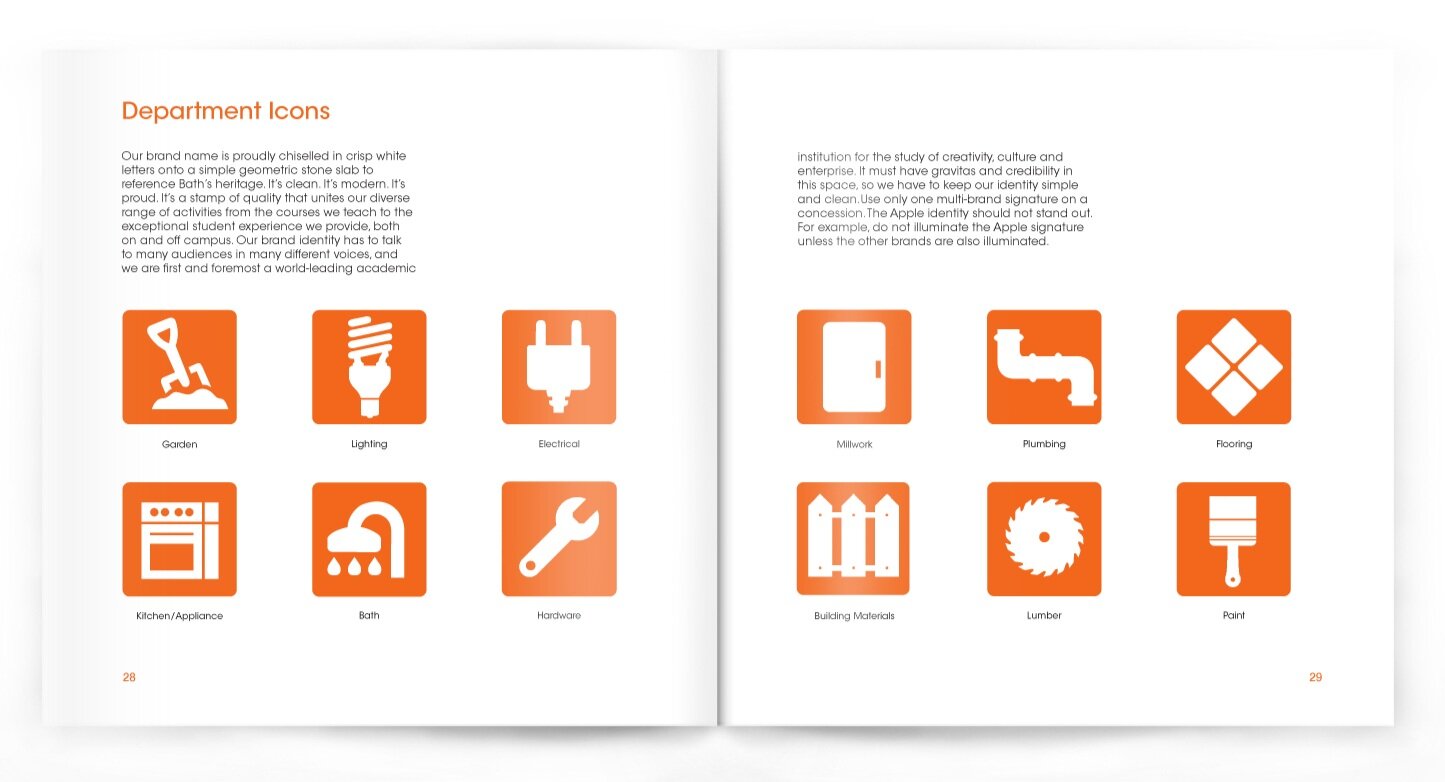
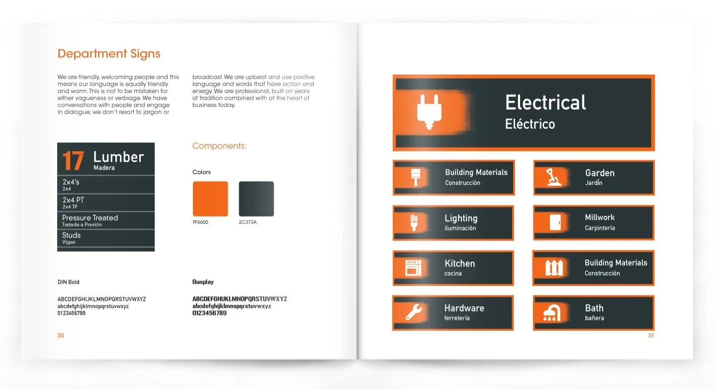
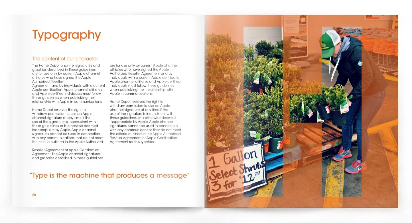
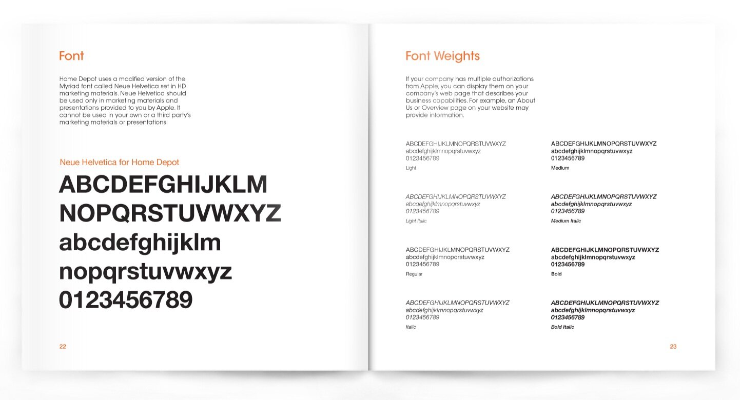
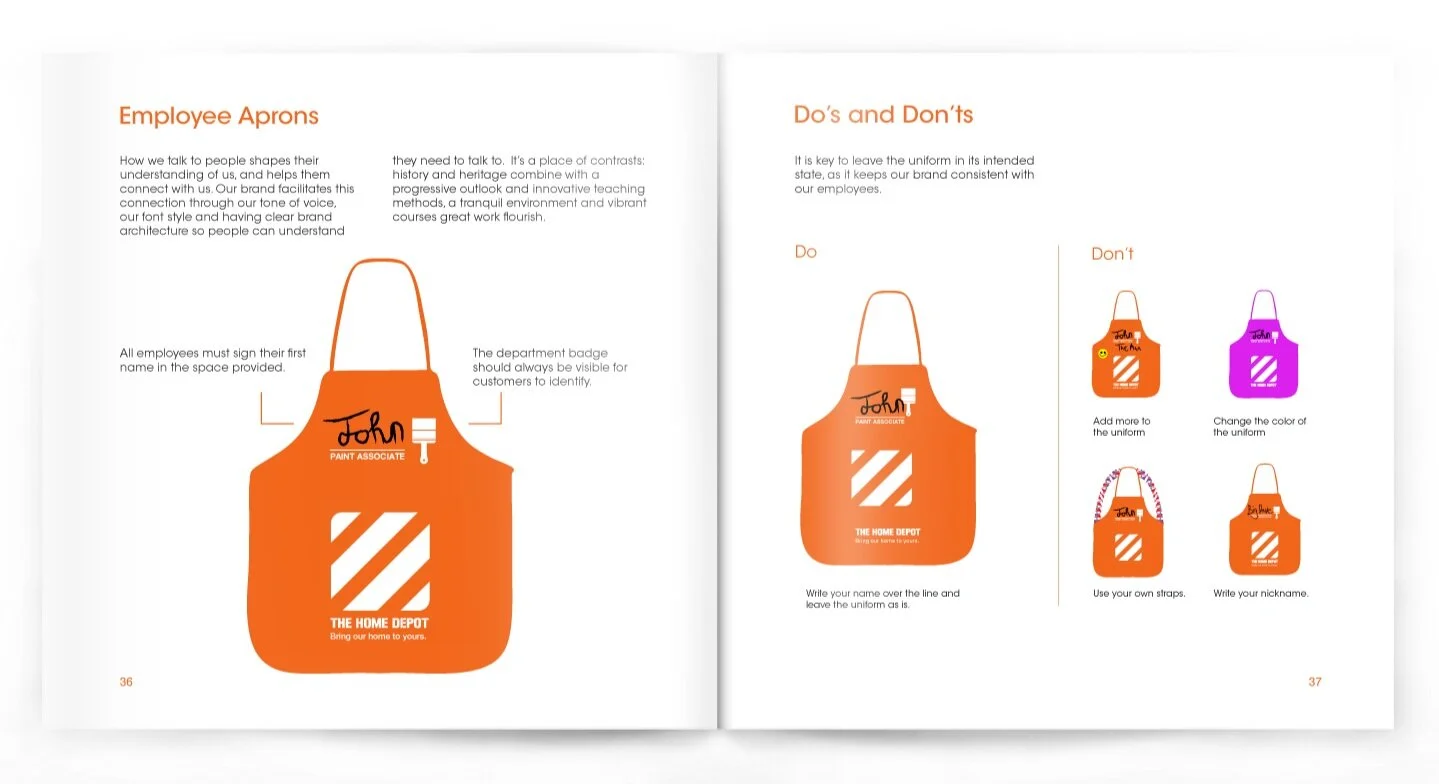
A concept for the #1 retailer in need of a re-design, The Home Depot. After working a summer in their store, I realized that the entire brand for The Home Depot has not changed in over 30 years. My goal was to visualize the most simplistic and impactful re-brand for the store. The focus was to start with the outdated logo and create a memorable brand mark, similar to other large retails such as Walmart or Target. Then moving into every other element of the brand from signage to the iconic orange apron, I pulled through all of my ideas into a brand identity guidelines booklet.


